Pantone vs CMYK for Packaging: How to Match Brand Color


Quick answer: Pantone is usually the safer starting point when one or two brand colors must stay recognizable across packaging runs. CMYK is usually more efficient for photographs, gradients, and complex artwork. The right choice depends on the color, substrate, print process, quantity, finish, and how closely the final package must match the approved reference.
A screen can make a logo look perfect while the carton arrives too warm, too dull, or slightly too blue. That is why brand color matching is a production decision, not just a design preference. Before approving artwork, decide how the color will be built, what it will be printed on, and which physical proof will control the final result.
Pantone vs CMYK: What Is the Difference?
Pantone printing uses a premixed spot ink identified by a standardized reference. The printer prepares that ink and applies it as a dedicated color. CMYK printing uses cyan, magenta, yellow, and black halftone dots in different percentages to simulate a broad range of colors. Pantone describes spot printing as a premixed method suited to close color matching, while process printing is useful for photographs and complex graphics; its official color-systems guide also distinguishes solid and process color workflows.
The important distinction is control. A Pantone number gives the designer, buyer, and printer a common physical target. A CMYK build gives the printer a recipe, but the appearance still depends heavily on the paper white, ink behavior, press condition, dot gain, coating, and color profile.

Neither method is automatically more accurate. A spot color can drift if the wrong paper reference is used or if the ink is adjusted without an approved drawdown. CMYK can reproduce a brand color well when the conversion, profile, proof, and production conditions are managed together.
When Should Packaging Use Pantone Spot Color?
Use Pantone when a small number of signature colors carry most of the brand identity. This is common for a cosmetics logo, a beverage label, a fashion box, or a retail carton with a solid background color. It is also useful when the same color must be repeated across several packaging formats and the buyer wants a clear approval reference.
Spot color is often a strong choice when:
- The logo or background must stay visually consistent.
- The artwork uses one to three solid colors rather than a photograph.
- A bright, saturated, metallic, pastel, or difficult-to-build color is important.
- The packaging will be produced in a process that supports dedicated inks.
- The brand team can approve a physical drawdown or press proof.
There is a practical warning: “Pantone” is not a magic password that makes every substrate identical. A coated reference and an uncoated reference can look noticeably different. Kraft, recycled board, grey board, and uncoated paper also change the visual result because the surface absorbs ink and contributes its own base tone.
When Is CMYK Printing Better for Packaging?
CMYK printing packaging is usually the practical route for photographs, food images, illustrated scenes, gradients, and artwork with many colors. It can also be the economical choice when the package is produced digitally or when a four-color process is already built into the press plan.
CMYK is a good fit when:
- The main visual is a photograph or detailed illustration.
- The design contains gradients, shadows, and many blended colors.
- The order quantity and print process favor process printing.
- The brand color has a realistic, approved CMYK simulation.
- The buyer is willing to control the result through a contract proof and press check.
CMYK is not the same as “whatever the PDF shows.” A file may contain a Pantone swatch that is silently converted, an RGB image that changes during output, or a rich black that creates registration and drying risks. Ask the supplier to confirm the color space, profile, ink sequence, paper, and proofing method before production.
Can You Convert Pantone to CMYK?
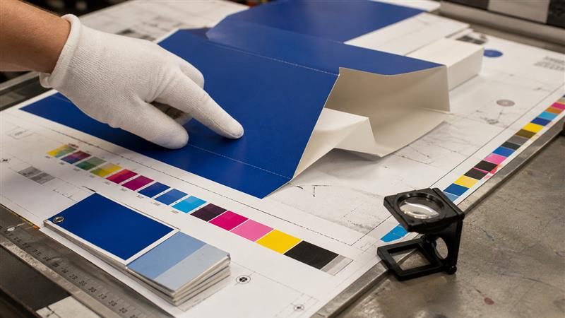
Yes, but the conversion is a controlled approximation, not a promise of identity. Some Pantone colors sit outside the printable CMYK gamut, especially very bright greens, oranges, blues, and certain fluorescent or metallic effects. The closest CMYK build may look less vivid or shift in hue.
For a Pantone-to-CMYK conversion, compare a physical Color Bridge-style reference or an approved proof under consistent lighting. Do not make the decision from a monitor, because the screen emits light while printed ink reflects light from paper.
When a brand color is important but CMYK is preferred for production, document both values: the original Pantone reference and the approved CMYK simulation. That gives future suppliers a starting point and prevents a later designer from choosing a visually similar but technically different blue or red.
When “Pantone” Quietly Became CMYK
A Polish packaging buyer came with one clear requirement: the colors on a premium folding carton had to be printed as approved spot colors, not silently converted to four-color process printing.
⚠️ What Went Wrong
During production, the artwork was changed to CMYK without clear customer approval. The buyer noticed the difference in a production video and immediately questioned the color process and ink source.
✅ How It Was Recovered
The team stopped arguing, checked the factory process, reviewed the conversation, and explained the situation honestly. The customer eventually gave the supplier another chance and placed a larger sticker order.
💡 The Packaging Lesson
A Pantone number is not enough by itself. The RFQ should state the spot-color reference, print method, substrate, proofing method, and whether CMYK conversion is allowed. If the process changes, the buyer must approve it before production.
What Changes Brand Color on a Package?

1. The substrate
Paperboard is not a neutral screen. White coated board usually holds ink differently from uncoated stock. Recycled or kraft board may warm the color, reduce brightness, or make a pale ink appear less clean. If the package has a dark or colored substrate, an opaque white underbase may be needed before the main colors.
2. The print method
Offset, flexographic, and digital presses do not build color in exactly the same way. The same CMYK percentages can produce different results between equipment, and a spot ink may require a different ink sequence or drying window. The quotation should identify the expected print method rather than simply saying “four-color printing.”
3. The finish
A gloss coating can make a color appear deeper and more reflective. Matte coating can soften contrast. Lamination, aqueous coating, varnish, or soft-touch finishes can all alter the way light reaches the printed surface. Approve color and finish together, because a color that looks right before finishing may look wrong after finishing.
4. The viewing condition
Warm warehouse lighting, daylight, and retail lighting can make the same package appear different. For important brand colors, the approval note should state the viewing condition and whether the supplier will use visual comparison, instrument measurement, or both.
For packaging that depends on accurate artwork, review the available custom packaging products alongside the material and print plan before finalizing the file.
Pantone Packaging Printing vs CMYK: A Buyer Decision Table
The table is a starting point, not a quotation rule. Production cost can change with the number of ink units, order quantity, press setup, number of SKUs, and whether the same color is used across different boards. Ask for the cost and risk of the complete package, not just the price of one extra ink.
How to Build a Repeatable Brand Color Workflow
- Define the color target. State the Pantone reference, approved CMYK values, or a physical master sample. Do not write “match the website blue.”
- Confirm the material. Record board type, coated or uncoated surface, recycled content if applicable, and the expected paper white.
- Separate artwork types. Keep logos, solid panels, photographs, gradients, and small text in the color spaces appropriate to each element.
- Request a proof. A contract proof or production drawdown is more useful than an email saying “looks good.”
- Check the folded package. Inspect the color on the actual panel, near creases, under the selected coating, and next to other SKUs.
- Record the approval. Save the final PDF, color references, substrate, finish, proof date, and any agreed tolerance in the purchase record.
That workflow also helps when the artwork travels between countries or suppliers. Pantone notes that physical guides age and that paper and process variation can affect appearance, so a current physical reference and production proof remain important. For CMYK files, the intended printing condition should be matched to a suitable ICC profile; the European Color Initiative’s offset-profile guidance explains why the profile should reflect the actual paper and press condition.
For buyers comparing factory workflow and repeat-order control, the company’s Smart Factory process is a useful place to review how artwork, sampling, production, and inspection connect.
Common Brand Color Matching Mistakes
- Approving color from a backlit monitor instead of a physical proof.
- Using a coated Pantone reference for an uncoated or kraft package.
- Converting a Pantone color to CMYK without approving the simulation.
- Comparing a coated sample with an unfinished production sheet.
- Changing the board, finish, or press method after color approval.
- Sending multiple “final” files with different spot-color names or percentages.
- Expecting a color to remain identical across white, recycled, and dark substrates without compensation.
One more mistake is treating color as a problem that can be fixed after mass production. Once thousands of cartons are printed and die-cut, a small color disagreement becomes a costly inventory decision. Spend the time at the proof stage, when the decision is still cheap to change.
What Should You Put in a Packaging Color Specification?
A clear RFQ or purchase specification should include the package dimensions, board construction, print method, number of colors, spot-color references, CMYK values, coating or lamination, and whether the proof must be made on the final substrate. Also state which areas are color-critical: logo, background, product name, barcode panel, or all visible panels.
Ask the supplier these practical questions:
- Will the Pantone color run as a dedicated ink or be simulated in CMYK?
- Which coated or uncoated reference should be used?
- What profile and proofing method will be used for CMYK artwork?
- Can the proof include the final coating and the actual board?
- How will repeat orders be compared with the approved master?
- What changes in cost, lead time, or minimum quantity result from adding a spot color?
For external technical reference, see Pantone’s spot-versus-process explanation and compare it with your printer’s actual production method. The official explanation is useful for terminology; the final decision still belongs to the approved package proof.
How to Choose: Pantone, CMYK, or Both?
Choose Pantone when the brand’s solid color is the main visual asset and close repeatability matters more than minimizing setup. Choose CMYK when photographs, gradients, and complex artwork dominate, or when the process and quantity make four-color printing more practical. Choose both when the package needs rich imagery and one highly controlled logo or background color.
The best result is often not the most expensive color route. It is the route that matches the visual risk. A small premium for a dedicated ink may be sensible for a hero color printed on many SKUs. A carefully approved CMYK simulation may be the smarter choice for a short run with photographic artwork.
Before requesting production, review your target color, board, finish, quantity, and delivery market together. If you need help preparing the specification, send the artwork and package details through the packaging quote contact page.
FAQs
Is Pantone always more accurate than CMYK for packaging?
No. Pantone provides a dedicated physical reference, but the result still changes with paper, ink, press, and finish. A well-managed CMYK proof can be the better choice for complex artwork.
What does “CMYK for Pantone” mean?
It usually means converting or simulating a Pantone spot color with cyan, magenta, yellow, and black process inks. The converted value should be approved physically because some Pantone colors are outside the CMYK gamut.
Can one package use Pantone and CMYK together?
Yes. Photographs can print in CMYK while a logo or solid background uses a dedicated spot color, provided the press and artwork are set up for the combined process.
Why does the same Pantone color look different on two boxes?
The boxes may use different board, coating, ink sequence, or viewing conditions. Coated, uncoated, kraft, and recycled surfaces do not reflect or absorb ink in the same way.
What should I send a packaging supplier for color matching?
Send the editable artwork, target Pantone or CMYK values, board and finish requirements, color-critical areas, quantity, and a physical master or approved proof when available. Ask the supplier to confirm the proof method before production.
Conclusion
Pantone vs CMYK is really a question of risk, control, and application. Pantone packaging printing gives a strong physical reference for important solid colors; CMYK printing packaging is efficient for photographs and complex graphics; using both can separate brand-critical elements from image-heavy artwork.
Whatever route you choose, match the color method to the actual substrate and finish, approve a physical proof, and document the production conditions. That is how brand color matching becomes repeatable instead of a hopeful comparison between a screen and a box.
Send Your Packaging Brief to Our Team
Share your product type, format, size, quantity, material, destination, and required date. Our team can support artwork review, sampling, production, inspection, and export coordination.
Contact us for a project-specific recommendation.
Ready to build packaging with a factory team?
Send your product size, material, artwork, quantity, destination, and deadline so our team can focus the first review on quotation and sampling.