Common Fonts for Packaging: Popular Typography Styles by Industry

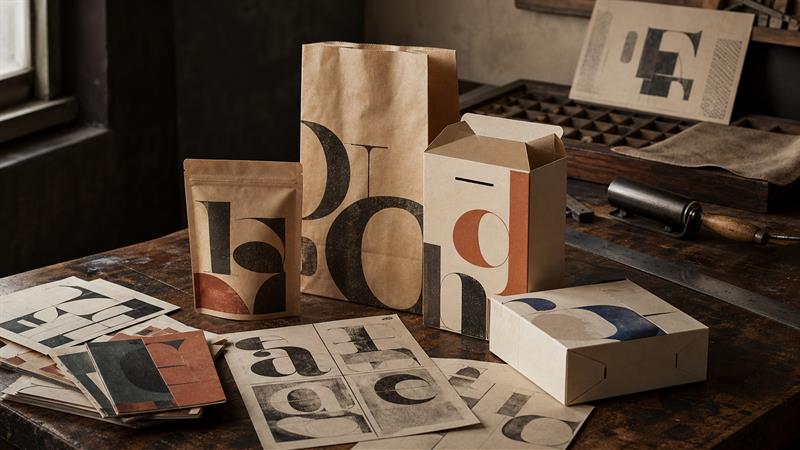
Before a shopper reads the ingredients, instructions, or product story, they notice the shape of the words. Common fonts can give a package a familiar starting point, but a typeface that looks right on a screen may become too thin, crowded, or ordinary once it is printed and folded.
This guide looks at fonts used by top brands in different industries, then moves the discussion onto the package itself: hierarchy, pairing, print size, material, dielines, and when common fonts should give way to custom typography.
Quick answer: Sans-serif and serif fonts are the most common starting points for packaging, with slab serif, script, handwritten, and display styles used when a brand needs a stronger mood. The right choice is the one that keeps the brand, product, variant, and required copy readable after printing and folding.
Key takeaways for packaging buyers
- Use industry examples to understand tone, not to copy a famous logo.
- Choose the type hierarchy before choosing extra typefaces: brand, product, variant, benefit, and required information.
- Check the smallest text on the actual substrate and finished package, not only in a screen mockup.
- One or two type families are usually enough; weight, size, spacing, and contrast often create better hierarchy than another font.
- Ask a packaging supplier to review folds, cut lines, ink coverage, proofing, and licensing before bulk production.
What are the most common font styles used on packaging?
“Common fonts” may mean widely available typefaces such as Helvetica, Futura, Garamond, or Georgia. It can also mean familiar visual categories. For packaging work, the second meaning is often more useful. A buyer usually starts with a feeling, not a font file.
Serif fonts
Serif typefaces have small finishing strokes on the letters and are often associated with heritage, craft, publishing, and premium goods. They can suit a tea carton, fragrance box, gift box, or food label. Fine serifs and high-contrast strokes may lose detail on rough kraft paper or small labels, so a heavier weight and more generous spacing may be needed in print.
Sans-serif fonts
Sans-serif fonts remove those finishing strokes. They are usually easier to read at small sizes and suit modern, technical, clean, or functional positioning. Weight, width, letter spacing, capitalization, and the shape of a few distinctive characters still change the mood. A broad geometric sans feels different from a narrow grotesk.
Slab serif, script, and display fonts
Slab serifs can give food, tools, outdoor products, or apparel a sturdy voice. Script, handwritten, and display fonts suggest craft, celebration, nostalgia, or personality. Let an expressive font do one job, such as the brand name or flavor, and use a quieter family for ingredients, care instructions, dimensions, and shipping labels.
| Font style | Useful for | Watch for |
|---|---|---|
| Serif | Heritage, premium, editorial, gift packaging | Fine strokes can weaken on rough board or small panels |
| Sans-serif | Modern, technical, clean, everyday products | Generic-looking systems need stronger spacing or a distinctive mark |
| Slab serif | Food, outdoor, tools, bold retail messages | Heavy forms can crowd small copy |
| Script or handwritten | Craft, celebration, natural or personal brands | Usually unsuitable for ingredients, warnings, or long instructions |
| Display | Short product names, flavor names, campaign packaging | Legibility drops quickly when reduced |
Fonts used by top brands in different industries: what to learn
Industry examples are useful when they reveal a pattern. They are less useful when they turn into a list of logos to copy. Many famous wordmarks are custom drawn, adjusted over time, or protected by licensing terms. They may look like a familiar font without being a font you can simply download and use.
Luxury, fashion, and beauty
Luxury, fashion, and beauty brands often use an elegant serif, a quiet sans-serif, or a mix of both. The visual system leaves space around the name and uses contrast sparingly. For a custom box, the lesson is not “use a luxury serif”; protect the breathing room around the main name and keep decorative type away from the product variant, net quantity, or required copy.
Technology and electronics
Technology packaging often leans toward geometric or humanist sans-serif styles. A family with several weights can work across an accessory box, shipping label, web page, and instruction panel. Electronics also expose a problem that brand boards can hide: small text must survive glare, dark backgrounds, barcode placement, and quick warehouse or retail glances.
Sports and active products
Sports and activewear brands commonly use bold, condensed, italic, or forward-leaning lettering. The forms suggest speed and energy, and they hold up well on large marks across cartons, mailer bags, and apparel tags. The supporting copy should usually stay calmer. If every line is loud, nothing feels fast anymore; it just feels crowded.
Food, beverage, apparel, and lifestyle
Food and beverage packaging has the widest range: a coffee box may use a simple sans-serif, a heritage serif, or hand-drawn lettering, while a snack brand may need heavier display type that reads from a shelf. Apparel and lifestyle fonts still need to survive hangtags, tissue, paper bags, mailer boxes, and online product photos.

How do you choose common fonts for packaging?
Start with the brand personality, then check the format
Write down three or four words that describe the brand in plain language: quiet, playful, technical, natural, traditional, or direct. Then test the leading options on the actual format and viewing situation. A folding carton, curved bottle label, subscription box, and shipping box all give typography different jobs. Before locking the type to a dieline, compare the structures in the custom packaging products range so the font is tested against a real format, not only a flat screen mockup.
Use the three-second shelf test
Reduce the front panel to a thumbnail or place it several feet away. Can someone identify the brand, product, and variant in roughly three seconds? If not, check contrast, competing weights, spacing, and the product-name position. The same test helps with ecommerce, where a package may shrink to a marketplace grid or social post.
What should shoppers read first on packaging?
A package is a small information system. The type hierarchy should tell the eye where to start and where to go next.
- Brand name: make recognition easy when it matters to the purchase.
- Product name: state what the item is without making the shopper decode the design.
- Variant or flavor: separate related SKUs clearly, especially when cartons share the same base artwork.
- Benefit or short message: use it to support the decision, not to bury the product name.
- Required information: favor legibility over personality for directions, warnings, ingredients, dimensions, and codes.
Hierarchy does not require five fonts. One family with different weights and sizes can do most of the work. The important point is that the visual order stays consistent across panels and across the product range.
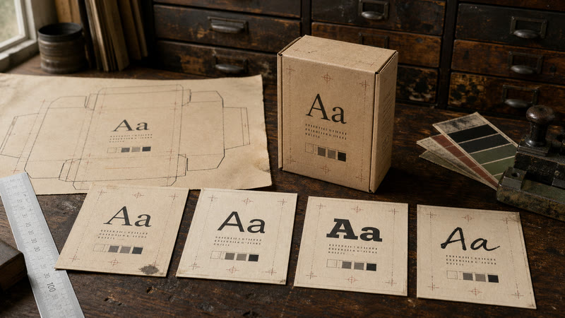
Serif vs. sans-serif: which is better for packaging?
Neither wins every job. Serif fonts can support heritage, sophistication, and editorial positioning; sans-serif fonts often suit modern, technical, and functional products. Both can look premium or ordinary depending on weight, spacing, contrast, material, and the rest of the artwork.
How should you pair fonts on a custom package?
Start with one dependable family and add a second only when it solves a clear problem. A serif headline with a neutral sans-serif body often works for beauty, gift, and food packaging; a bold display or condensed style with calm supporting copy can suit energetic products. Try weight, size, capitalization, and spacing before adding a third typeface. If several people will handle the artwork, a licensed library such as Adobe Fonts can also make font access and usage easier to document before release.

Common fonts packaging vs. custom typography
Common fonts are practical because they are widely available and easy to share across boxes, labels, bags, and digital channels. The limitation is sameness: a familiar font can make a small brand look like many others. A hybrid route often works better—keep a readable font for product information, then make the logo, product name, or one display element distinctive.
If custom common fonts means “make this familiar style feel like ours,” a modified wordmark may be more useful than hunting for a rare typeface. A common fonts supplier can compare available families, but the packaging partner should also review the dieline, proof, substrate, and final print conditions. Verify commercial usage rights before artwork is released.
Common fonts are easy to find, but “free” does not always answer every production question. When a team selects a family from Google Fonts, check the individual family terms and commercial-use conditions before the artwork is shared with a printer.
Why do fonts that look good on screen fail in print?
Packaging typography is affected by board or film, surface texture, ink spread, print process, coating, folds, and viewing conditions. Thin strokes can disappear, white text can look smaller on a dark background, and condensed type can become uncomfortable when reduced.
Test the smallest copy at final printed size on the actual substrate. Check contrast, cut and crease distances, and the assembled pack; there is no universal minimum size for every material, ink, language, and format. Ask for a proof when the design uses small text, reverse printing, fine lines, or a dark solid background.
The W3C contrast guidance is written for digital content rather than printed packaging, but the principle still helps: low contrast makes quick reading harder.
The Screen Looked Right. The Sample Told the Truth.
A skincare brand had a clear packaging direction, but the design still needed to survive color checks, sampling, and real production.
On screen, the packaging looked convincing. During the production review, however, the team found that the printed colors still needed adjustment. The customer needed more than another digital preview; they needed a result they could compare with the real package.
The design team joined video meetings to review the artwork, explain RGB and CMYK differences, and prepare several Pantone options. Physical samples were then used to compare the colors directly. This changed the conversation from “Which version looks better?” to “Which version works on the actual material?”
The sample met the customer’s expectations. After further design communication, a customer visit, and production follow-up, the project progressed into bulk production and packing.
The sample is where a font, color, and layout stop being a screen idea and become real packaging.
What this changes for a packaging font decision
The Screen Looked Right. The Sample Told the Truth.
A skincare brand had a clear visual direction. The turning point came when the team compared the approved screen artwork with real printed samples.
BriefA clear look and product mood
Color reviewRGB, CMYK, and Pantone options
Physical sampleCompare ink, material, and scale
ProductionMove forward with confidence
The initial design looked convincing on screen, but printed color needed a closer look. The design team joined video reviews, compared RGB, CMYK, and Pantone references, and prepared practical options instead of arguing from one digital preview.
Once the physical samples arrived, the decision became easier. The customer could see the finish, compare the printed result with the artwork, and judge whether the typography still felt balanced at the size used on the package. After the sample met expectations, the project moved into customer follow-up, bulk production, and packing.
The sample is where a font, color, and layout stop being a screen idea and become real packaging.
What packaging buyers can take from this

How can buyers score a packaging font before ordering?
When two or three options seem close, score them for brand fit, small-size readability, differentiation, hierarchy flexibility, print performance, package-format compatibility, and licensing. Then print a short proof at actual size. The best option is the one that still reads when the package is assembled, photographed, stacked, shipped, and viewed under ordinary lighting.
When should a common fonts supplier review the artwork?
Once the type system is approved, keep the dieline, fonts, colors, and artwork revision controlled in one file. Confirm whether fonts should remain live or be outlined. Forests Packaging can review dimensions, artwork placement, materials, printing, sampling, and production assumptions for custom boxes, paper bags, mailers, and cartons.
FAQs
What fonts are commonly used for packaging?
Sans-serif, serif, slab serif, script, handwritten, and display fonts are all common. The best choice depends on brand personality, package format, viewing distance, and how much supporting information must fit.
Should packaging use serif or sans-serif fonts?
Either can work. Serif fonts often support heritage or premium positioning, while sans-serif fonts often support modern or functional positioning. Weight, contrast, spacing, material, and hierarchy matter more than the category name alone.
How many fonts should you use on packaging?
Most packaging systems work well with one or two type families. Use weights and sizes to create hierarchy before adding another font. Additional typefaces should solve a clear communication problem.
Can I use a famous brand’s font on my own packaging?
Do not assume that a recognizable logo is an available font or that its commercial usage is free. Check whether the lettering is custom drawn, confirm the license for the specific typeface, and use the brand only as visual research rather than as artwork to copy.
How can I test a font before ordering packaging?
Place the actual brand name, product name, variant, smallest required copy, and barcode area on the correct dieline. Print a proof at final size, assemble the package, and check contrast, folds, cut lines, surface texture, and reading distance before approving bulk production.
Conclusion
Common fonts are a useful starting point, not a shortcut around packaging decisions. The right choice depends on the brand, audience, package format, hierarchy, material, print method, and how small the type must become. Industry examples can provide direction, but physical proofs decide whether the idea works.
If you are comparing fonts used by top brands in different industries, look past the logo and ask a more practical question: will this typography help a real package identify, explain, and protect the product? That is the standard common fonts packaging should meet.
Request a packaging typography review
Forests Packaging can help turn an approved type direction into practical custom printed packaging. Share the product dimensions, package format, material preference, artwork status, quantity, target market, shipping destination, and deadline so the review covers the real production conditions. For related examples of materials, formats, and production decisions, browse the packaging blog guidance before preparing the brief.
Send the brief through the custom packaging inquiry page. If the type is small, reversed, decorative, or placed near a fold, include the artwork or a marked-up reference and ask for a physical sample or proof.
Send Your Packaging Brief to Our Team
Share your product type, format, size, quantity, material, destination, and required date. Our team can support artwork review, sampling, production, inspection, and export coordination.
Contact us for a project-specific recommendation.

Ready to build packaging with a factory team?
Send your product size, material, artwork, quantity, destination, and deadline so our team can focus the first review on quotation and sampling.